
Brand
Brand assets, colour, typography, and the visual rules for using them. Everything here is rendered from the shared brand package and the shared UI package, so what you see is what the products ship.
Principles
Six rules the rest of this page exists to serve. If a swatch, a spacing value or a component below looks off-brand, a token drifted. Fix the token, not this page.
| Principle | What it means in practice |
|---|---|
| The apps are the design system | haqq-app-mono (chat, efirm, libs/ui) authors every token and component contract. This repo consumes it, with three sanctioned divergences: a warm cream ground, the two brand ramps, and larger display type. Anything else that differs from the apps is drift, not a website choice. |
| Tokens or it doesn't ship | Every colour, radius and shadow on this page is a token in the shared theme, the @theme block in libs/web-brand/src/index.css. A hard-coded hex in a component is a bug even when it looks right, because the next theme change cannot reach it. |
| One of everything | One card, one button component, one input, one badge. Where the site used to have two of something, one of them was a migration leftover and got deleted, not documented. |
| The gradient is an allowlist, not a signature | The wine-to-navy gradient is legal on exactly three announcement-bar components and nowhere else: not the hero, not a button, not a logo lockup. On every surface at once it stops signalling anything; kept this narrow, it still does. |
| Space is the premium signal | The section rhythm and the container widths below do more for how the brand reads than any colour choice. Tightening them to fit more in is the fastest way to look cheap. |
| Legal-serious means quiet | Restraint is the brand. Reach for a hairline border and a shadow before a fill, and for a fill before the gradient allowlisted for the announcement bars. |
Logos
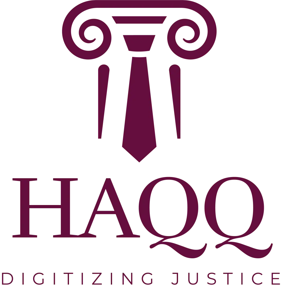
Four approved marks. The full lockup is the default; the others exist for the places it does not fit. Keep clear space around every mark, never recolour or distort one, and reach for the reverse mark on dark or gradient backgrounds rather than dropping the primary onto a dark card.


Wordmark
Type only: nav bars, footers, docs
Icon mark
Favicon, app icon, avatar

| Mark | Use it for | File |
|---|---|---|
| Primary mark | Full lockup (icon, wordmark and tagline) on light surfaces, the default choice everywhere. | haqq-logo-purple.webp |
| Reverse mark | The same full lockup in white, for dark cards and the signature gradient only, never on light. | haqq-logo-white.webp |
| Wordmark | “HAQQ” type only, no icon, for tight horizontal spaces: nav bars, footers, docs. | On request |
| Icon mark | The pillar-and-tie glyph only: favicon, app icon, avatar, and other tight square slots. | On request |
Colour
Two brand ramps and a set of semantic tokens. Wine is the primary; navy is the gradient partner, reached only through the ramp. haqq.purple still resolves as a deprecated alias of haqq.wine. It is there so old call sites compile, not for new work.
Wine: primary
Default #66023C, exposed as bg-haqq-wine-* and as the --primary token.
Navy: the gradient partner
Default #002C6C, exposed as bg-haqq-navy-*. Navy carries no semantic token of its own: it is the gradient's second colour and the second voice in a diagram, reached directly through the ramp rather than through --secondary, which is a neutral surface (see below).
Semantic tokens
Fourteen tokens, transcribed from libs/web-brand/src/index.css. Interfaces are built from these, not from the ramps directly: a component that reaches past a semantic token to a raw shade is the thing that makes a theme impossible to change later. Four of the fourteen are the status scale (--destructive, --success, --warning, --info), new to this repo as of the PR #480 alignment: before them, 1,509 raw Tailwind palette classes such as bg-green-500 and text-red-500 did the job these tokens do now.
The gradient
One gradient, defined once as --gradient-primary: linear-gradient(200deg, var(--color-haqq-wine-500) 18%, var(--color-haqq-navy-500) 72%), which resolves to linear-gradient(200deg, #66023C 18%, #002C6C 72%). It ships as the .gradient-primary utility, with .gradient-cta as a legacy alias that the Button component's gradient variant reads.
.text-gradient still exists in the stylesheet and it is not brand expression, it is an effect. Use text-foreground or text-primary on a heading instead of reaching for it.
Typography
Poppins does everything in Latin script (UI and headings) at four weights: 400, 500, 600 and 700. Cairo covers Arabic and RTL, headings and body: the same face the product apps use, so the typeface does not change when a reader crosses from the marketing site into eFirm or Legal AI. Cairo carries Latin too, so a product name or a numeral inside an Arabic sentence stays in one face. There is no third family.
font-poppins
The quick brown fox
UI and every heading in Latin script. Loaded at 400/500/600/700 only.
font-cairo
الخط العربي
Arabic and RTL, headings and body. Applied automatically (see below).
Nothing sets the Arabic face by hand. @haqq/web-brand/index.css switches the whole document to it on html[lang="ar"] and html[dir="rtl"], headings and body together, so a page that renders correctly in English renders correctly in Arabic without a font class anywhere in it.
| Level | Classes | Weight |
|---|---|---|
| Display / H1 | text-4xl sm:text-5xl md:text-6xl leading-[1.05] tracking-tight | 600 · font-semibold |
| H2 | text-3xl sm:text-4xl md:text-5xl leading-[1.12] tracking-tight | 600 · font-semibold |
| H3 | text-2xl md:text-3xl leading-[1.2] | 600 · font-semibold |
| H4 | text-xl md:text-2xl leading-snug | 600 · font-semibold |
| Body-lg | text-lg leading-relaxed | 400 · font-normal |
| Body | text-base leading-relaxed | 400 · font-normal |
| Small / caption | text-sm leading-normal | 500 · font-medium |
| Eyebrow | text-xs uppercase tracking-[0.12em] | 600 · font-semibold |
Weights
Four are loaded: 400 regular, 500 medium, 600 semibold, and 700 bold. Two are yours to type: font-medium and font-semibold. 400 is the body default. 700 stays loaded only because <strong> in prose renders it by browser default; font-bold is not a class the system uses, and a heading that needs more presence takes a larger size instead. The face is not loaded at any other weight, so font-light, font-extrabold and font-black render as a browser-synthesised approximation rather than the real thing. Treat those as unavailable.
Spacing, radius and shadow
Vertical rhythm
Sections carry the brand more than colour does, which is why the fifth principle above is about space. A standard section is py-16 md:py-24; a hero or marquee band is py-24 md:py-32. There is no third value.
Containers and gutters
Three container widths carry the whole site.
| Use | Class | Width |
|---|---|---|
| Default content | max-w-6xl | 1152px |
| Wide / marquee | max-w-7xl | 1280px |
| Prose / centred copy | max-w-3xl | 768px |
Every container carries the same gutters, px-4 sm:px-6 lg:px-8, so content never touches the viewport edge on a phone. Inside one, three grid gaps do all the work: gap-6 between cards, gap-8 between feature rows, and gap-4 for tight lists. Body copy is measured, not full-bleed (about 68 characters), via max-w-[68ch] or the prose container.
Component spacing
Below section rhythm sits a tighter, component-level scale. gap and space-y run on 1, 1.5, 2, 3, 4 and 6. Padding runs on p-3, p-4, p-6; px-2, px-3, px-4, px-6; and py-2, py-2.5, py-3, py-4. A marketing section's own vertical rhythm, above, is allowed to run higher because that is layout, not a component.
Icon sizes
size-4 is the default icon, matching a Button or an Input's own scale. size-3.5 is for a dense row, and size-3 is what an icon takes automatically inside a Badge or a Chip.
Radius
Radius comes from one variable and resolves to one class. --radius is 0.625rem, and every corner in the interface is rounded-md (calc(var(--radius) - 2px), 8px). Cards, inputs, buttons, chips, avatars, tabs and controls all take it. rounded-lg, rounded-xl, rounded-2xl, rounded-3xl and rounded-full are not part of the system: there is no circle and no pill anywhere in HAQQ. Across chat, efirm and this package's fifty-six primitives combined, rounded-full appears seven times, and every one is a mark under 12px: an unread dot, a status dot, a workload pip. At that size the exemption is not even needed: a border radius clamps to half the shorter side, so an 8px radius on any box up to 16px square already renders a full circle. size-2 rounded-md is a circle for free.
Elevation
| Class | Use |
|---|---|
| shadow-xs | Resting card, the default |
| shadow-sm | A surface that genuinely sits above its ground |
| shadow-md | Hover state. Sparingly |
| shadow-lg | Overlays only: dialog, sheet, dropdown, tooltip. And drag states |
| shadow-xl / 2xl | Not in the system. A marketing card is not more elevated than a modal |
| shadow-haqq-wine/N | Not in the system. The apps ship no tinted shadows |
Components
These are the shipping components from @haqq/web-ui, rendered live, not pictures of them. The Button's implicit default, no variant prop at all, is a solid bg-primary fill, not the gradient: gradient is a real variant and it is allowlist-only (see above), kept mainly so this page and its equivalent in apps/main can keep showing the true contract.
| Variant | Reach for it when |
|---|---|
| default (no variant) | Every page or section primary action. Solid bg-primary. This is the default and it is not a gradient. |
| secondary | A neutral second action beside a default primary. Renders neutral grey now, not navy. |
| outline | A hairline border, no fill, for tertiary actions and toolbars. Pair with size="sm" in dense contexts. |
| ghost | No fill until hover, for dense UI, icon buttons and nav items. Pair with size="icon-sm" for a row action. |
| link | An inline text action inside a sentence. |
| destructive | Errors and irreversible actions only. Never as an accent. |
| gradient | Allowlist only: the announcement bars, above. No call site anywhere else in the codebase. |
Those seven are the whole set @haqq/web-ui/button ships. An eighth, wine, is a deprecated alias of the default (the same bg-primary fill): six call sites remain from before the Button's default flipped off the gradient, and it takes no new ones.
| Size | Metrics | Use |
|---|---|---|
| sm | h-8, px-3, text-xs | Dense rows and toolbars. |
| default | h-9, px-4 py-2 | Everything else. |
| lg | h-10, px-6 | Hero and pricing CTAs. |
| xl | h-[50px], px-8, text-lg | The apps' own brand-expressive CTAs. Arbitrary height on purpose: this matches the apps exactly rather than rounding to the scale. |
| icon / icon-sm / icon-lg | size-9 / size-8 / size-10 | A square button holding one glyph. |
Badge
Card
One card primitive, not six. @haqq/web-ui/card renders the root as rounded-md border bg-card text-card-foreground shadow-sm, the same 8px radius every other surface takes. The border and the shadow do the lifting, never a different background hue, which is the second half of the “legal-serious means quiet” principle. GRO-970 replaced six bespoke pricing shells and the Editorial and Moritz card wrappers with this one component.
Card title
CardHeader, CardTitle, CardDescription, CardContent and CardFooter (composed, not configured).
Body content sits here at p-6 pt-0, so the header and the content share one gutter.
Input
@haqq/web-ui/input renders h-9 rounded-md border border-input bg-background px-3 py-1 text-base shadow-xs, with a focus-visible:ring-[3px] on the border rather than the old 2px ring with an offset. Same height as the Button's default size, so a form row lines up without a wrapper forcing it.
Eyebrow: retired
The uppercase kicker line above a heading is gone sitewide. @haqq/web-ui/eyebrow still exists and still typechecks, but it renders null: it was kept as an empty shell so the roughly fifty existing call sites compile without a churn PR. Do not add a new one, and do not hand-roll the uppercase tracking span it used to produce. The Eyebrow row in the type scale above is still a real level (docs uses it for the small labels on this page). It is the marketing pattern that was retired, not the type size.
Illustration and ink
Every drawing on any HAQQ surface is an inline SVG built from the same frame and the same palette. There are no raster illustrations, no icon fonts and no third-party illustration packs.
Ink: colour where a class cannot go
The first principle above is “tokens or it doesn’t ship”, and an SVG is where it is hardest to keep. A fill attribute, a <linearGradient> stop, a canvas export and a build-time OG-card script can none of them resolve a Tailwind class, so for years each one typed the hex. @haqq/web-brand/ink is the module that ends that: every value below is read from the same ramp Tailwind compiles, so a drawing cannot invent a colour.
| Token | Ramp step | Value | What it is for |
|---|---|---|---|
INK.wine | wine 500 | #66023C | The primary mark, and the fill of anything that IS the brand. |
INK.line | wine 600 | #560232 | A drawn stroke, a leading rule, type on paper. Reads as ink. |
INK.deep | wine 700 | #450129 | Print-weight wine, for artwork meant to look like a document. |
INK.warn | wine 400 | #7E2A5B | The one warm accent, where a red warning would be too loud. |
INK.navy | navy 500 | #002C6C | The gradient partner, and the second voice in any diagram. |
INK.navyDeep | navy 800 | #00183B | Print-weight navy, used for the certificate's body type. |
INK.paper | not on a ramp | #FBFAF8 | The ground under an artwork that leaves the page. Never --background: an exported PNG has no stylesheet, and transparent means black type on black in a dark client. |
Anywhere a class works, use the class: fill-haqq-wine, stroke-border, fill-card, fill-muted-foreground. Those follow the semantic layer and adapt with it. Reach for INK only where a class cannot go.
The three kinds, and when to redraw
They look alike and they age in opposite directions. Getting this wrong is how a changelog quietly starts lying about what shipped in 2025.
| Kind | What it depicts | When to redraw it |
|---|---|---|
| Product | An idea about what the product does, such as a clause being flagged, a matter workspace, a redline applied. Deliberately not a specific screen. | When the capability changes. These are the ~104 drawings in the shared library and the only ones a redraw improves. |
| Release | Three or four things that ACTUALLY SHIPPED in one version, inside the chrome of the surface they shipped to. | Never. It is a record of a date. Editing one to match today's UI falsifies the changelog. |
| Interface | A real screen as it is today, for example the sign-up flow, the invite dialog, the credits meter. | Every time the screen moves. It is a claim about the present and goes wrong the moment the product does. |
Surface chrome
Four frames (the eFirm shell, the chat window, a browser, a phone) live in one module and are shared by every release and interface drawing. The shape of the frame answers “where does this live” before a word is read, which only works while there is exactly one of each. Six hand-drawn browsers would drift, and the drift would destroy the only signal the system provides. Draw a fifth frame only for a surface HAQQ actually ships to.
Brand voice
Every line below is quoted from live product copy, not written for this page. There is no locked tone-of-voice guide in the repo; this is the sourced inventory, so treat it as evidence of how HAQQ sounds rather than as a rulebook.
Primary
“Everyone deserves a great lawyer.” (the homepage H1, home.hero.h1).
Supporting line (home.hero.description): “Good legal help used to depend on your budget and where you live. HAQQ changes that: the same reasoning top firms use now reads your lease, drafts your contract, and answers your question, secure and governed throughout.”
The signature phrase “Digitizing Justice” is set in the gradient and nothing else. It is the founders' own words rather than a marketing line. The founder Q&A on Founder's story describes the mission as “to digitize and systematize justice delivery” and “justice should never be out of reach”, which is what the phrase is compressing. The company one-liner is “HAQQ is an AI-powered legal practice management platform that combines advanced AI with comprehensive law firm tools.”
Per-product taglines
Each line below is the string a visitor actually sees, with the key it renders from, so a deck or a pitch quoting one can be checked against the live site rather than against somebody's memory of it.
| Surface | Tagline | Key |
|---|---|---|
| Home (A/B variant) | Draft, research, and review in one AI chat | home.hero.h1Variant |
| Legal AI landing | Stop wrestling with legal work. Start executing it. | legalAILanding.hero.title |
| Legal AI workspace | The AI-Native Legal Workspace for Modern Legal Teams | legalAIWorkspace.hero.titleLine1–3 |
| eFirm | The operating system for your legal practice | pm.heroTitle + pm.heroTitleHighlight |
| eBar | Digitize Your Bar Association | ebar.hero.title |
| eWallet | The Lawyer's Financial Hub | ewallet.hero.title |
| Justinian | Introducing Justinian, a new frontier for legal intelligence | justinian.title + justinian.subtitle |
| Mobile | Your legal practice becomes fully mobile. | legalOS.mobile.tagline |
Products
Five products, each with one tagline and one description. The descriptions are the exact meta description each product page ships (seo.*.description), the same words a visitor or a search engine sees, so quoting one here cannot drift from the live page.
| Product | Tagline | Description |
|---|---|---|
| Legal AI Chat | Draft, research, and review in one AI chat | Legal AI chat built for lawyers. It drafts contracts, researches case law and answers jurisdiction-specific questions with citations. Free to try. |
| eFirm | The operating system for your legal practice | Law firm management software: matter management, time tracking, billing, document automation and legal CRM with a built-in Legal AI Engine. |
| eBar | Digitize Your Bar Association | Digitize your bar association with HAQQ eBar: member services, e-voting, subscription renewals, certificate issuance and filings, online from anywhere. |
| eWallet | The Lawyer's Financial Hub | Centralize your law firm's finances with HAQQ eWallet: trust accounting, payroll and client billing in one digital wallet built for lawyers. |
| Justinian | A new frontier for legal intelligence | HAQQ's proprietary Legal AI Engine: jurisdiction-aware reasoning, citation-backed answers, and contract drafting built for law firms. |
The company boilerplate is on About HAQQ, the founder bios on Founder's story, and the spokespeople and downloadable photography on People; coverage, announcements and the media desk are on Press.